
✹❋✹
Brand Development - Case Study
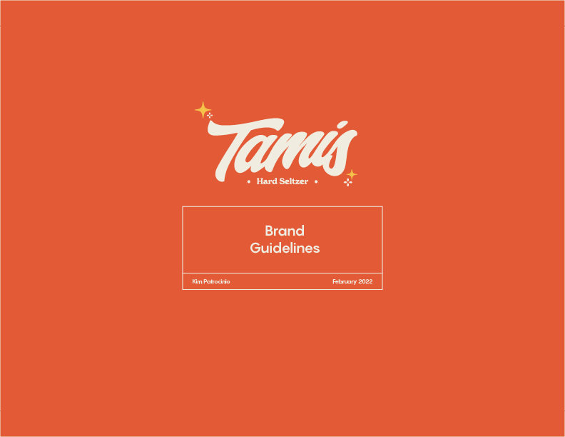
Tamis
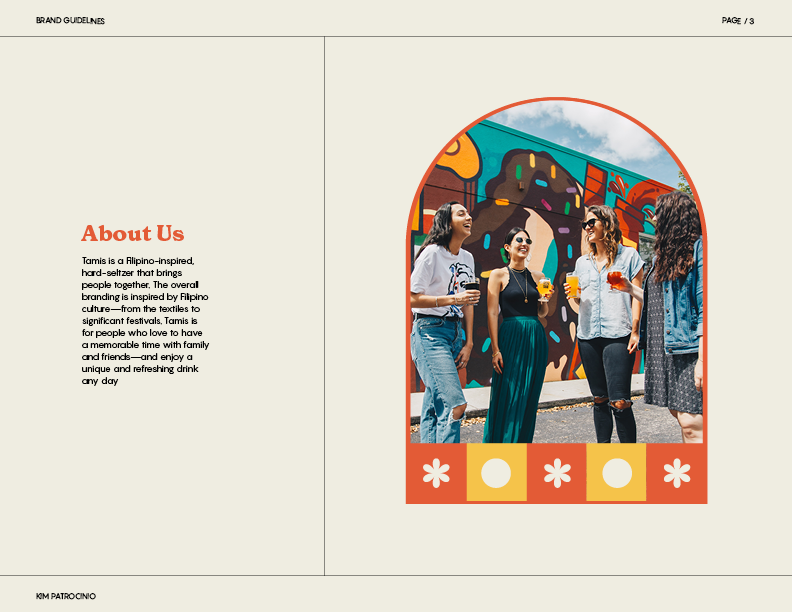
Tamis is a Filipino-inspired, hard-seltzer brand that promises to bring people together. The company's overall branding is inspired by Filipino culture—from the textiles to significant festivals. Tamis is for people who love to have a good time with friends and family.
My Role
Solo Designer — Discovery, Research, Design
Tools Used
Adobe Illustrator, Photoshop, InDesign, Procreate
Duration
January - April

Purpose
As western brands of hard seltzers become increasingly popular in North America and Western Europe, Tamis hopes to capture a portion of that market with their eye-catching design and flavours inspired by the Philippines.
Design Process
01. Discovery - Research, Moodboard
02. User Personas
03. Logo Development & Brand Guidlines
04. Packaging Design
Logo Development
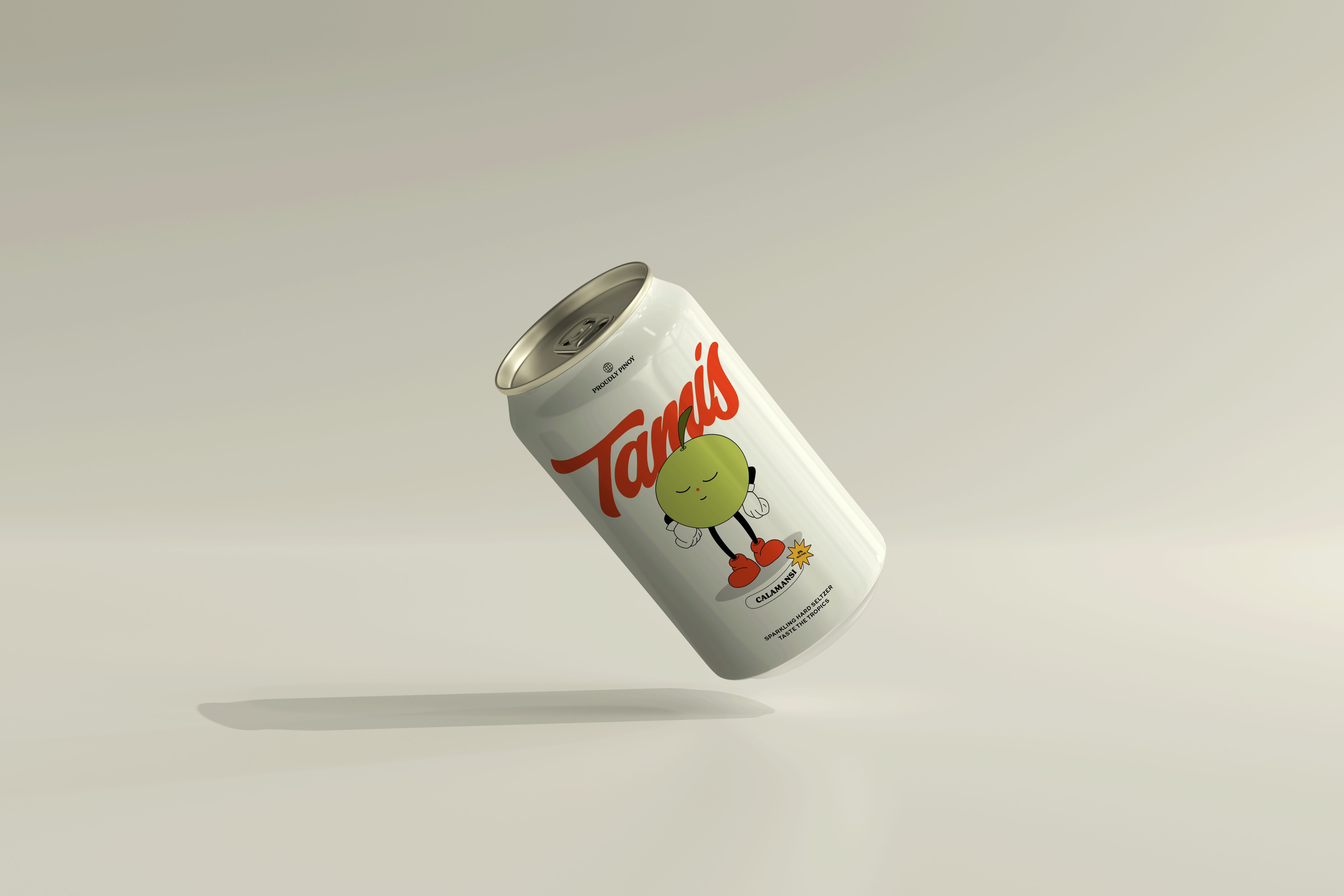
The name Tamis (‘Ta-Mis’) means “sweet” in the Bisaya dialect of the Phillippines. The flavours of Tamis will be the sweet fruits locally grown in the country.
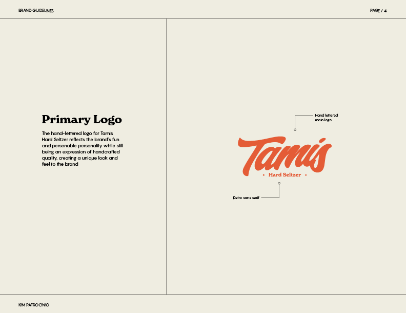
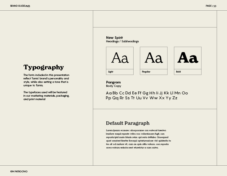
Hand lettering is a prominent aspect of the Philippines and everyday lives; you would see it on jeepneys and sari-sari (convenient) stores, I wanted the Tamis logo to reflect this nostalgic feeling with a hand-lettered wordmark that is both retro and memorable.


Brand Guidelines
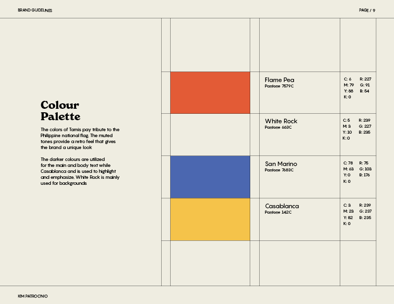
The Philippines has a variety of festivals, which celebrate the country’s history, culture, and landscape. These brand markers and patterns take inspiration from traditional weaving textiles and costumes. The colours of its national flag inspired the branding of Tamis. The muted primary colours add a retro touch to the overall brand while still paying homage to its home country.
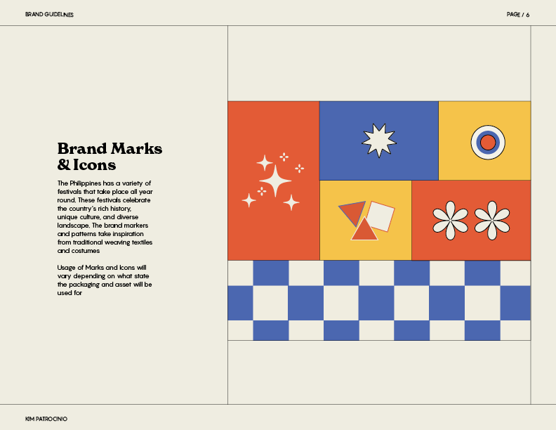
Tamis' visual identity, including its logo and packaging, tells the story of the country's heritage. The hard seltzer is inspired by the Philippines' geography, culture, and people — conveying a sense of the flavours one is likely to experience when tasting the beverage.
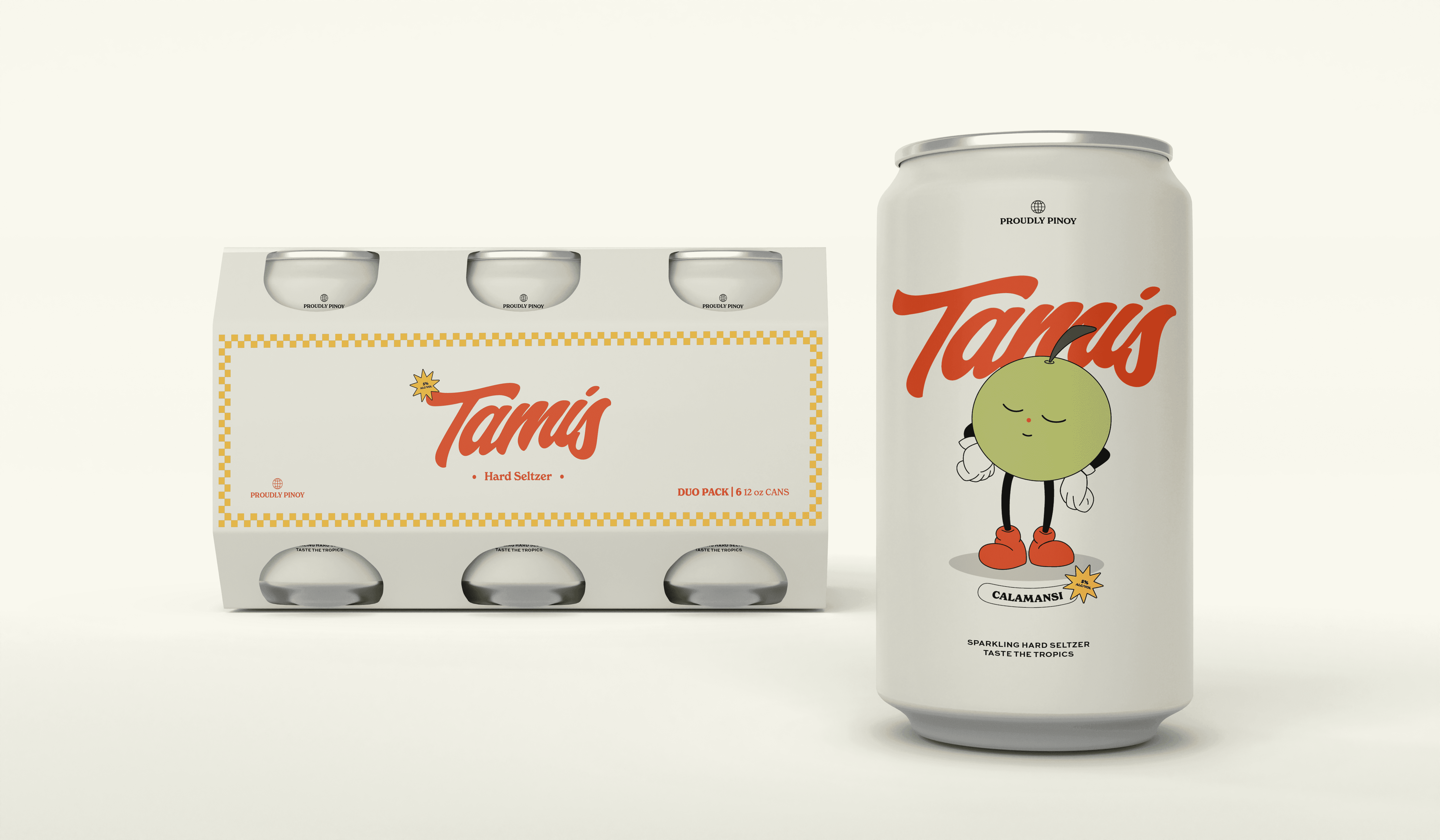
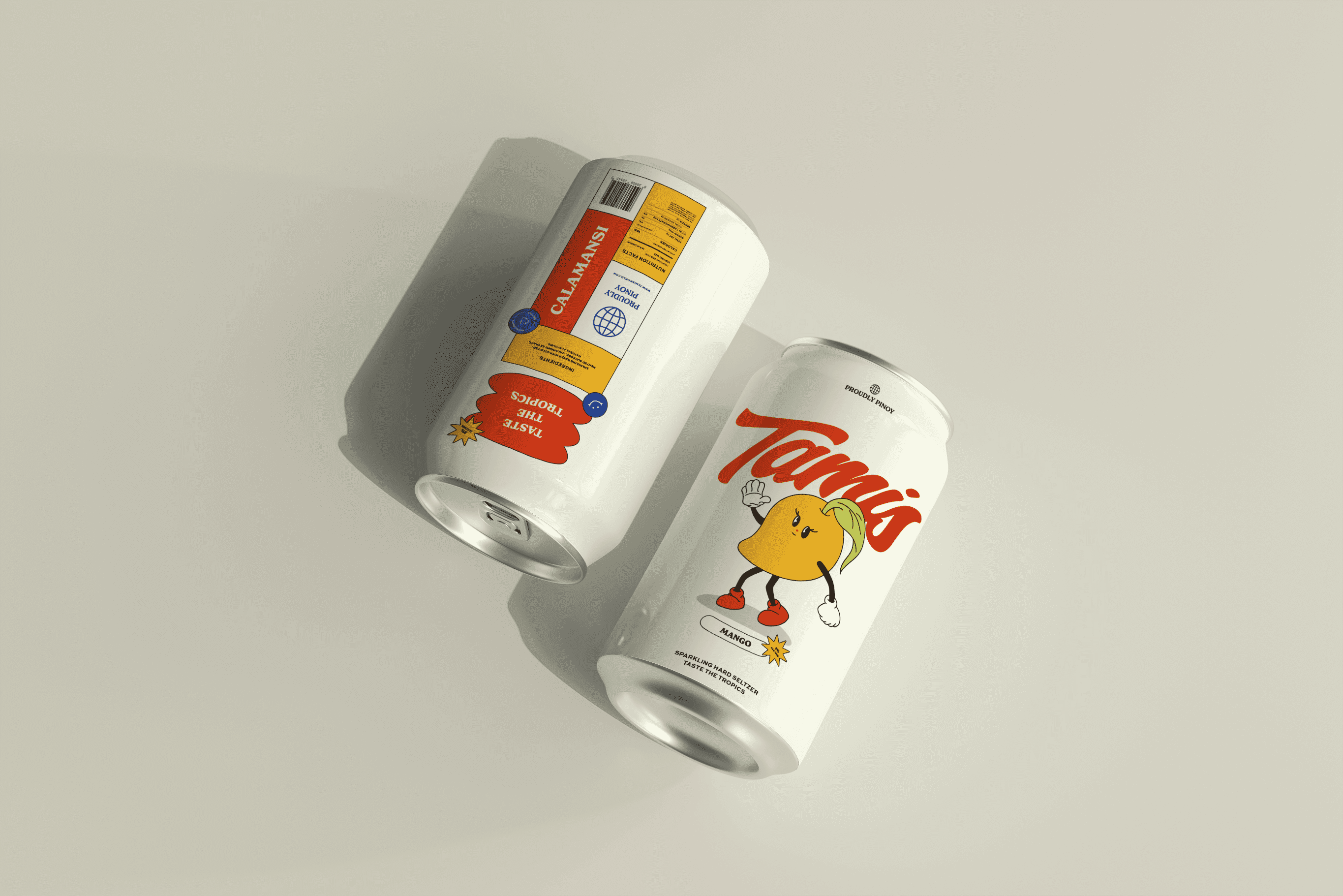
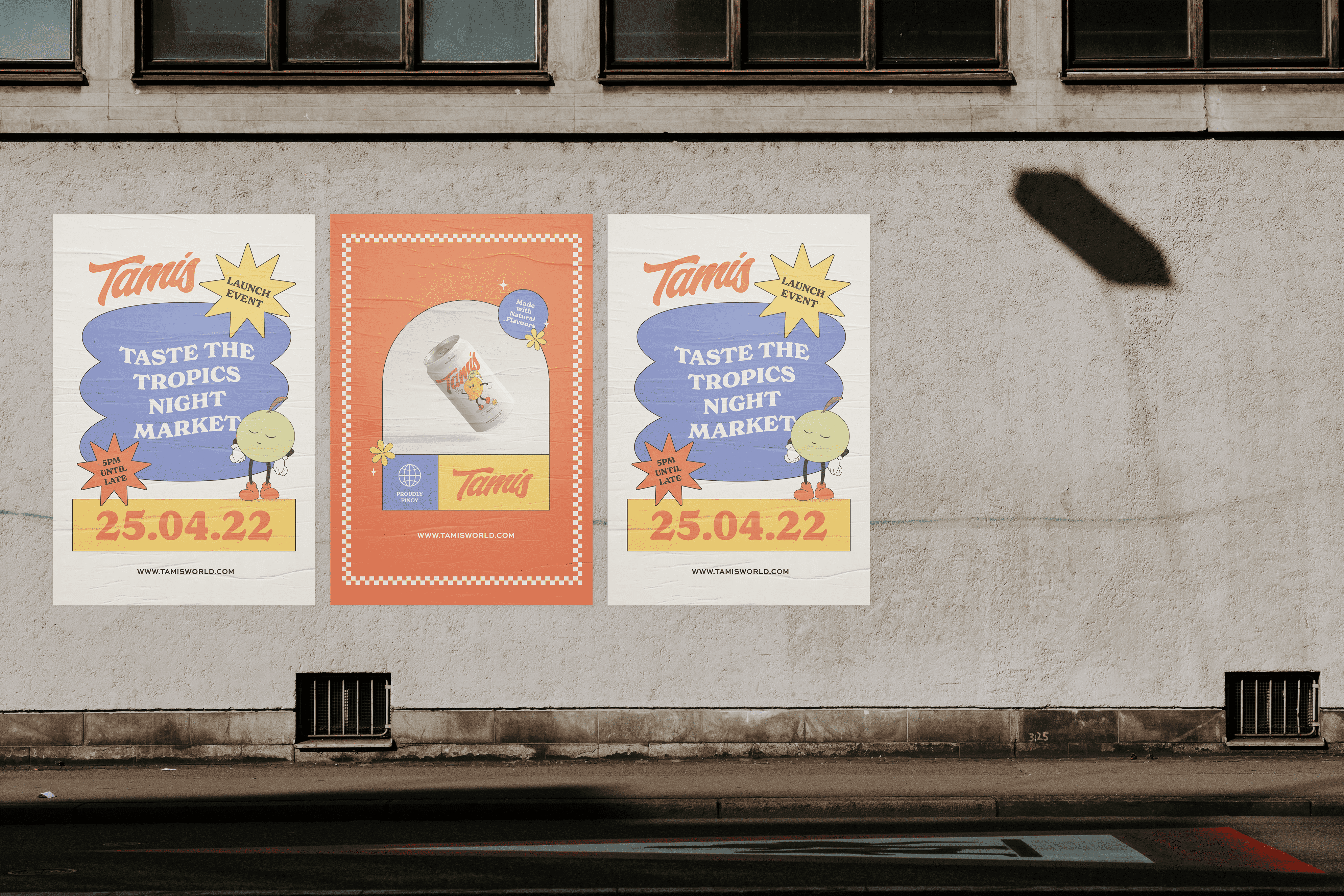
Packaging Design & Promotion
The mockups and packaging for the hard seltzer made from fruits of the Philippines communicate the unique experience of drinking it.
Final Thoughts
After Tamis's branding and packaging design was completed, it was exciting to see the final product come together. The completed brand guidelines will be used as a reference for additional packaging mockups and future developments for the brand.
✹ This is an on-going project, stay tuned for more! ✹
© KIM PATROCINIO | ALL RIGHTS RESERVED 2024