
✹❋✹
Editorial Design - Case Study
Padayon Magazine
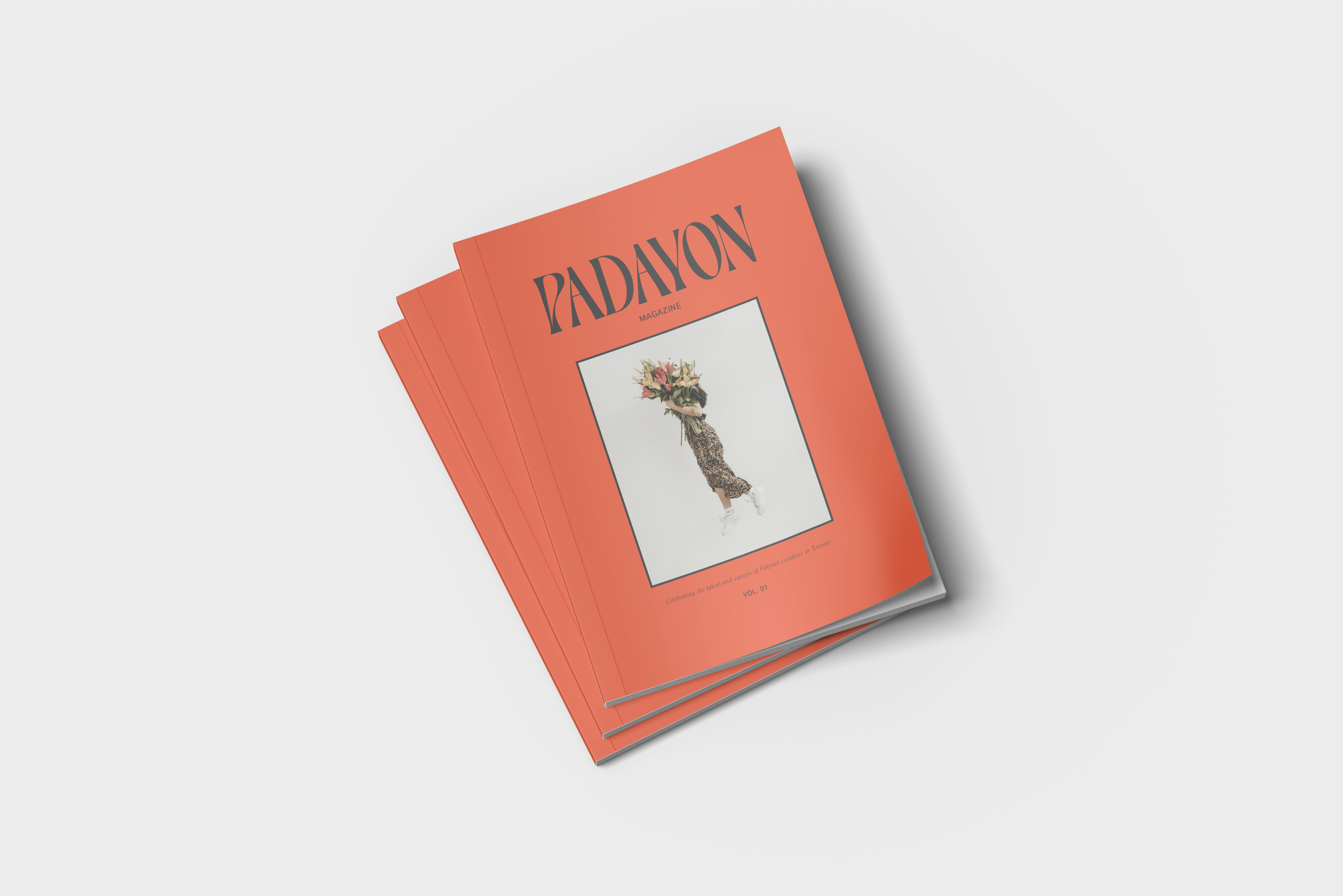
Padayon highlights the talents of Filipino artists, writers, photographers and designers living in Toronto. It was founded to showcase a collective of Filipino voices and hopes to reach various demographics to highlight the creativity of the Filipino community.
My Role
Editor & Designer
Tools Used
Adobe InDesign, Illustrator, Photoshop, Artivive
Duration
September - December
Overview
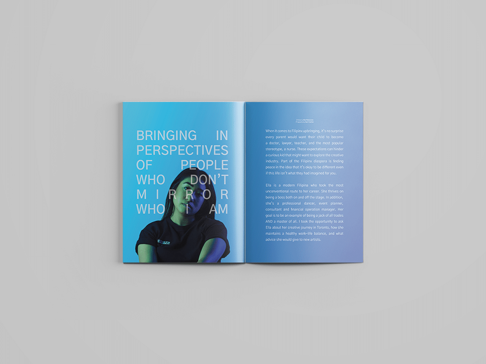
The content of this magazine was generally taken from articles found online, except for the cover story, which was produced in-house. I interviewed trailblazer and multifaceted artist Ella Avila via zoom and asked her about her journey as a Filipino woman navigating through Toronto's creative community.
Design Process
01. Discovery - Research, Moodboard
02. Nameplate & Flat Plan
03. Grid System & Article Example
04. Crtitique & Revisions
05. Setup for Print - Preflight
06. Press & Print
Discovery
After determining the magazine's niche, I began designing layouts by researching how I would organize content. Since the project spanned many weeks, I was able to arrange articles and ads in different configurations before making a final decision. The discovery phase took about 5 weeks to complete, from research, mood boarding, typesetting, and testing out flat plans.
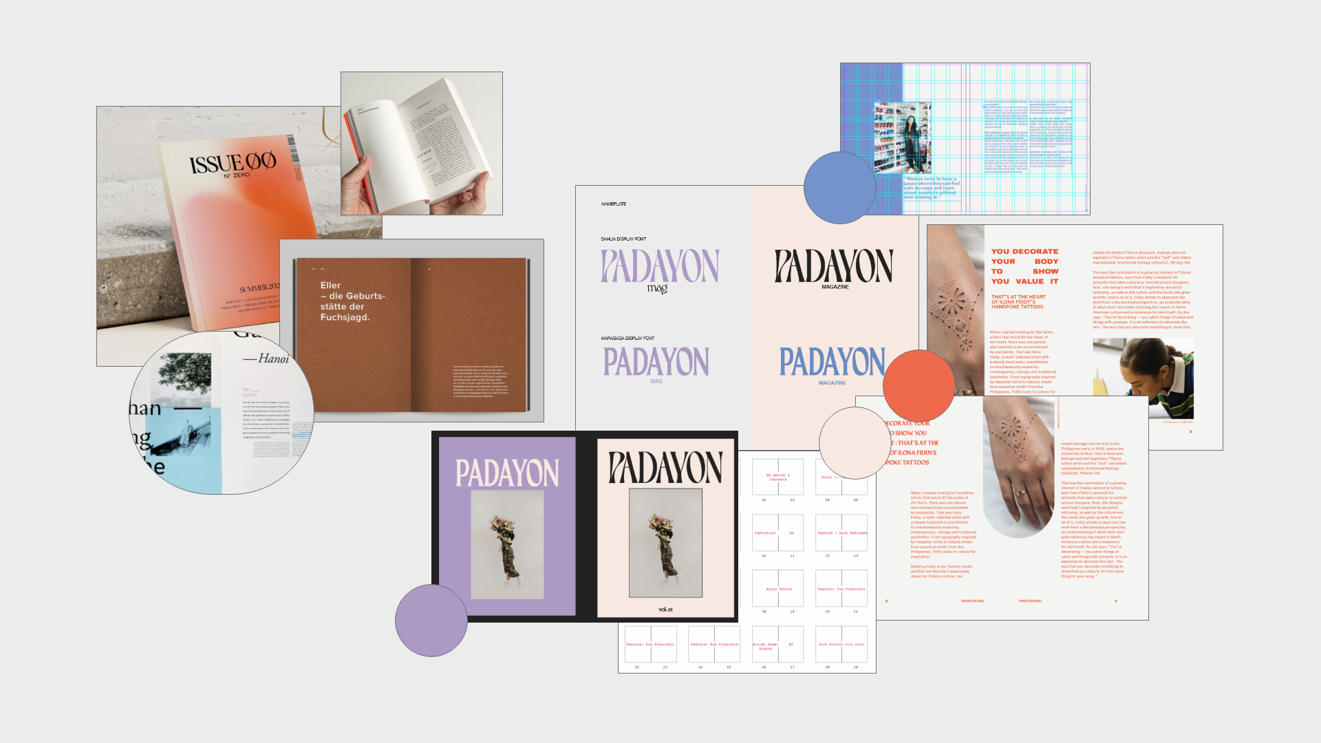
Typography
This publication uses Maragasa Display, a typeface designed by Filipino designer John David Masa. It is partnered with Gothic A1 by Hanyang I and co, it is a versatile sans serif offered in 9 weights.
Feature Article
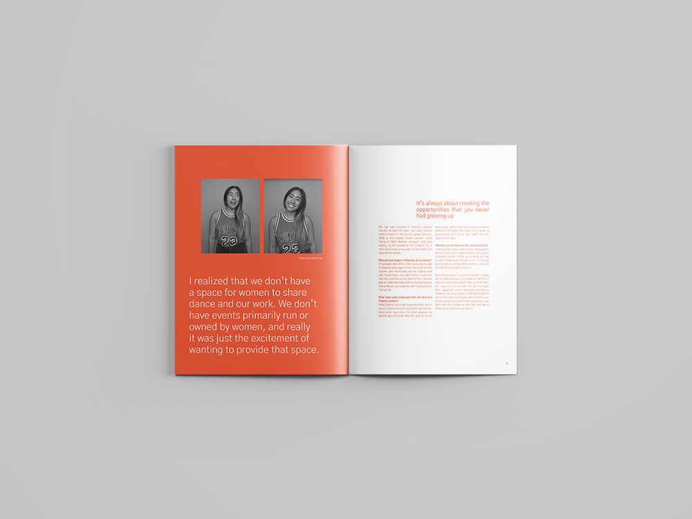
One of the challenges I chose to take on during this project was to conduct my own interview for the feature article. Ella Avila is a dancer and event organizer who has done great work for the dance community in Toronto. She has organized many women-focused events to help unite and empower creatives in the city.
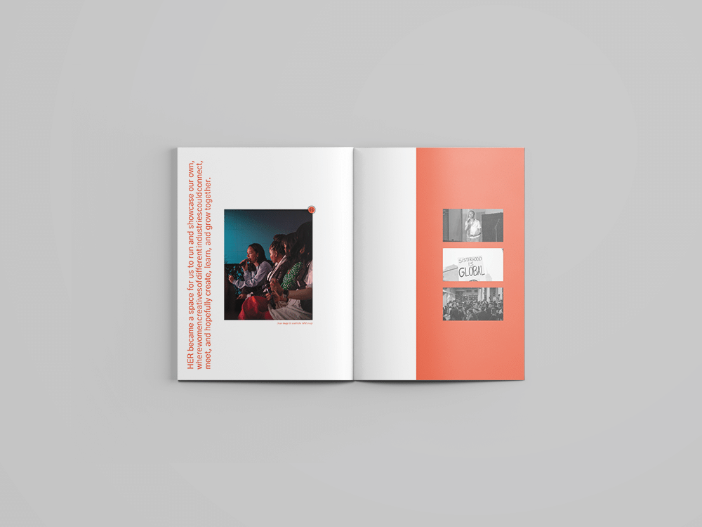
Bringing stories to life. In conjunction with the Artivive app, readers can scan images and bring stories to life when going through the magazine.
While brainstorming ways to make the printed magazine engaging, I thought of adding augmented reality (AR) experience by incorporating videos and interviews with select artists in each issue. The reader would have both a digital and a tactile experience by scanning images in the magazine to see the videos and interviews.
Final Thoughts
My first experience with Editorial Design was exciting and challenging, but in the end, I was happy with my final product. I especially liked creating something dedicated to my culture. Representation is necessary, and growing up as an avid J14 collector, I never really saw anyone that looked like me. I also have a newfound appreciation for printed magazines. The tactile experience of flipping pages and sinking onto the couch to read an issue is much more enjoyable than reading digitally.
Lastly, I wish scratch and sniff advertisements still existed 🍒🍊🍇🍎
© KIM PATROCINIO | ALL RIGHTS RESERVED 2024